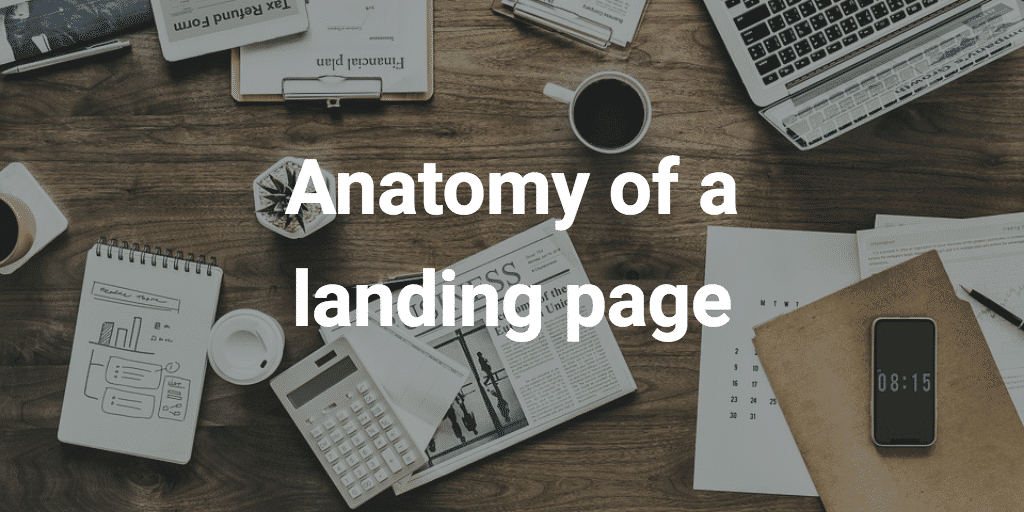
The anatomy of a high-performance landing page
There are many good presentations of what a good landing page is but there are also some specific aspects to subscription-based e-commerce that need to be taken into consideration.
In order to simplify things, we will summarize a good landing page around 7 elements:
Your logo
It is a question of credibility and brand image. If you already have an established company, displaying the logo clearly will enhance the consistency between your brand and your subscription e-commerce service. If you do not have an established brand yet, it is even more important to have a professional logo because you must immediately establish trust with your visitors. First impression is essential. No one will be willing to pay, or even give their email address if your landing page does not inspire confidence.
Beautiful images
Since you are a new player, visitors to your site will be looking to determine what kind of business you are. The images you choose will reflect the personality of your company without having to explain it in words. Here is where to find beautiful royalty-free images. For example, you can put a picture of your target customers and convey the emotion that your service/product will bring to them. You can also put a picture of your service/product, or a prototype to show what you have to offer. Or you can choose a more minimalist approach by playing with visuals, colours, typography. In any case, think about what your visuals emotionally convey.
The tagline / value proposition
The tagline must present exactly what you have to offer. It must be crystal clear. Go to your competitors and take inspiration. Think about the Why as Simon Sinek put it.
A brief description
You will need a sentence or two to present the services in your subscription offer. It must include what you did not convey through your tagline. The description must be sufficient to convince the user to order your service/product. Be personal, show why your service will make their life easier.
The ‘call-to-action’ button
This is certainly the most important part of your page. The objective of your landing page is to get as many emails as possible. Getting these emails is important for the second phase of your launch, it will be your point of contact with your future prospects.
The reward
This is especially true if you are an unknown company. In order to encourage visitors to give their email, they must be offered a reward. For example a special promotion or discount, the possibility of winning a free subscription. Remember to make this award particularly visible, put it in bold or underline it in order to make sure that every visitor will see it.
Social networks
Give your visitors the opportunity to share your page on social networks. This is the least important point because it is not often used but think about it anyway, if some visitors do it it is free advertising!
Beyond the landing page
In addition to the landing page, we recommend the creation of a launch video presenting your services / products. The video doesn’t have to be perfect but it can really help the understanding of the service. The founder can for example film himself and explain the concept in front of the camera. This has the advantage of putting a face and voice on the company and the brand.
Now that your teaser page is in place, it’s time to use it by collecting as many feedbacks as possible and creating buzz.
If you are not getting the expected results or the number of email addresses you were expecting, you may need to change some aspects of your landing page. For example, test a lower price, or change the frequency, from monthly to bi-monthly. A/B testing can really optimize the results of your landing page. You can even test several strategies at the same time.